The Meaning of Colour
in Animation

"Colour! What a deep and mysterious language, the language of dreams." Paul Gauguin
The appreciation of animation is, like any artform, a subjective one. When it comes to choosing colours for your animation, decisions are also subjective and often made on the simple basis of 'because I like it'. There's nothing wrong with going with your own taste and instinct but the use of colour is more important than you might think.
Colour choice in animation is even more important than in live action as you are basically starting from a 'blank canvas' - everything on the screen needs a decision as to what colour it is going to be as you are creating it from scratch. These choices might initially seem daunting but it also gives you a greater degree of control over the image and with that control, comes the ability to tell a story exactly the way you want to.
Colour can have a profound effect on your film so it's worth understanding a little about the processes of how it works, and your decisions should be influenced by an understanding of the science behind it.
The colours used in a film create an emotional response in viewers so having a basic understanding of colour theory can help you set the mood of a film and affect how the audience responds as the story progresses.
.
Ultimately the choices you make might be subjective, but colour works on a deeper psychological level than more obvious elements like image, dialogue or plot. The feelings it evokes supports the story in a similar way to music.
The Meaning of Colour
From an early age, we associate certain colours with certain feelings. Sometimes these are automatic - green for nature, black for night etc. Sometimes they are pushed on us by society - blue for boys and pink for girls so pink is associated with feminine aesthetics. The humble traffic light has a huge influence. Red means stop or danger. Amber means get ready to change. Green means go (or more positive feelings). These meanings are embedded into our consciousness.
Everyone has favourite or disliked colours. Our own personal relationships to colours are complex. It could be the result of a traumatically disliked wallpaper on a childhood bedroom wall or because of stimulus in the world around us - "I like nature so I like green, I support this football team so I like red etc".
Colours also have different meanings for different cultures and nations so keep that in mind if you are aiming for an international audience. For example, in Western culture, yellow can suggest cowardice while in Japan, it means courage. White often implies purity or innocence but in some Asian countries, it is the colour of mourning and death.
The temperature of a colour is also important. We associate red, yellow and orange with heat (fire) and blue and green as cooler colours (water, nature) so the use of a specific colour in a scene, or in combination, can affect the perceived temperature of that scene.
The age of your target audience is also a factor. In general younger audiences like bold and varied colours while audiences prefer a more muted palette.
Colour Theory
Colour Theory is both a science and an art. It's a set of rules and guidelines which explains how we perceive colour and the impact of how colours combine, match or contrast with each other. It also looks at the messages that colours communicate.

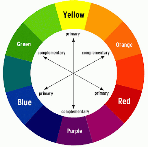
The first RYB colour wheel was designed by Sir Isaac Newton back in 1666 and has changed very little since then (although other versions have since been created such as the RGB colour wheel which is used when mixing light on computer screens).
A colour wheel shows primary and secondary colours and how colours work well in combination. For example Blue and Orange is a combination used extensively in film scenes because of the contrast between warm and cold and the dynamic tension within a scene this can create.
If you understand and accept that certain colours have certain meanings, it gives you an additional tool in the storytelling process. By using, maintaining or switching colours or colour combinations, you can control the emotional impact of your film.
Trying to explain colour theory using just words is like trying to learn how to paint by reading a book - it's not the ideal medium to do so. So here's a brilliant 7-minute explainer video that will show you all the key basics of how colours work together.
The three standard characteristics of colour are:
- hue (the colour itself)
- saturation (the brightness or purity)
- value (the lightness/darkness).
By adjusting these characteristics to varying degrees, you can create a whole range of colours and so create different meanings. So a healthy tree that is a vibrant green can become sickly by going yellow and paler. A cosy home can become more menacing with darkness and the red glow of a fire.
You can get deeper into colour theory by then looking at colour schemes which explains combinations like analogous colours, triadic colours and so on. It's fascinating so do have a look if you have time.

By planning the colour palette for your animation and making some key choices, you can create meaning and emotion within the story. This can be a consistent palette throughout or a shift in colours, denoting a change in mood or tone.
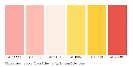
Establishing a colour palette and sticking to it will give your animation a distinctive identity that is instantly recognisable and creates unity. Breaking from that palette should be done for a reason - such as wanting to change the mood and convey a message. Check out some of these palettes used for animation characters.
Choosing Colours for Animation and Commercials
Although there is no definitive research that proves it is true, it is generally believed that colours do have a psychological impact on us. So the colours you use for your film should be chosen carefully.
Red is not usually used as a colour for bedroom design as it is considered a dynamic colour that increases heart-rate and adrenalin - not really ideal for sleeping.
Red, orange, brown and yellow are considered warm colours and their effect is to arouse, energise and agitate.
Green and blue are considered cool colours and are conducive to calm and relaxation. In nature there is usually a balance between warm and cool. Likewise in film, there should be a balance. Tipping the scales in the warm or cool direction will have an impact on the meaning of a scene or sequence. The way they are used and the combination they are used in will also have an impact. E.g. blue can be made cooler or warmer depending on the hue, saturation and value, as well as the colours around it.
This colour psychology is especially important in advertising commercials where the need to deliver the correct message and to convey the correct feelings for the brand are of paramount importance.
Colour Scripts
A Colour Script is a very useful tool in the creative process which was first used by Pixar and has since become used frequently in the production process. It's a simple, practical document, kind of like a storyboard for colour, that gives you an overview as to which colour combinations relate to the specific emotional beats of the story. There's no 'right way' to make a colour script - you use whatever works for you personally - but it's a good way of stepping back, visualising the whole film and seeing how the colour is working (or not) within your film .
Here's a great video of the colour script for Cloudy with a Chance of Meatballs
Conclusion
By choosing the right hue, saturation, and/or value for the scenes and key moments in your animation, you can establish and control the feeling that you want to convey. There are some generally accepted rules for colour theory and colour symbolism but you can give any meaning to each colour you've chosen - as long as it's clearly defined and used consistently. Don't forget that rules can be broken or twisted, but understanding how and why you use colour in your animation allows you to create an extra layer of meaning to your film.
